반응형
시본(seaborn)은 맷플롯립(matplotlib) 기반의 데이터 시각화 라이브러리입니다. 그래서 대체적으로 맷플롯립과 함께 사용하여 더 높은 수준의 그래프를 생성할 수 있습니다.
import seaborn as sns
print(sns.get_dataset_names())
['anagrams', 'anscombe', 'attention', 'brain_networks', 'car_crashes', 'diamonds', 'dots', 'dowjones', 'exercise', 'flights', 'fmri', 'geyser', 'glue', 'healthexp', 'iris', 'mpg', 'penguins', 'planets', 'seaice', 'taxis', 'tips', 'titanic']
tips = sns.load_dataset('tips')
tips.head()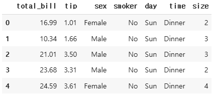
tips.info()
# 팁 데이터셋 불러오기
tips = sns.load_dataset('tips')

# 1. figure에 2개의 서브 플롯을 생성
fig = plt.figure(figsize=(15, 5))
ax1 = fig.add_subplot(1, 2, 1)
ax2 = fig.add_subplot(1, 2, 2)

# 2. stripplot() 그리기
sns.stripplot(x='day', y='tip', hue='sex', data=tips, alpha=0.7, ax=ax1)

# 3. swarmplot() 그리기
sns.swarmplot(x='day', y='tip', hue='sex', data=tips, palette='Set2',
              alpha=0.7, ax=ax2)
ax1.set_title('Strip Plot of Tip by Day and Gender')
ax2.set_title('Swarm Plot of Tip by Day and Gender')
plt.show()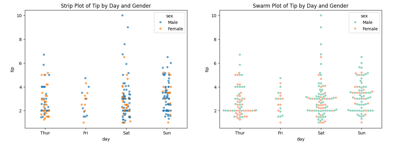
1. 범주형 변수 산점도 그래프 : 범주형 변수와 연속형 변수 간의 관계를 시각화하는 그래프
tips = sns.load_dataset('tips')

# 1. figure에 2개의 서브 플롯을 생성
fig = plt.figure(figsize=(15, 5))
ax1 = fig.add_subplot(1, 2, 1)
ax2 = fig.add_subplot(1, 2, 2)

# 2. 식사가 이루어진 시간대 파악
# x축 변수, 데이터셋, axe 객체(1번째 그래프)
sns.countplot(x='time', data=tips, ax=ax1)

# 3. 식사가 이루어진 시간대 파악과 식사가 이루어진 요일로 색상분류
# x축 변수, hue로 색상 분류, 데이터 셋, 색상 설정, axe 객체(2번째 그래프)
sns.countplot(x='time', hue='day', data=tips, palette='Set2', ax=ax2)

ax1.set_title('Frequency of Tips by Time')
ax2.set_title('Frequency of Tips by Time and Day')
plt.show()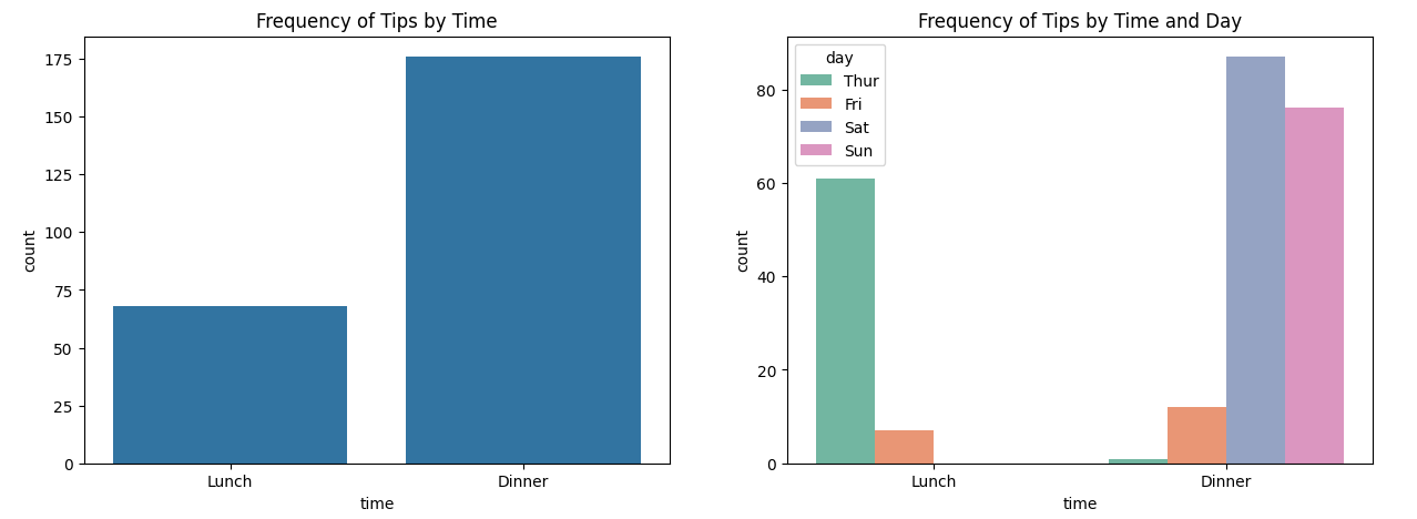
2. 빈도 그래프 : 범주형 변수의 각 카테고리별 빈도를 막대 그래프로 나타내어 각 카테고리의 상대적 크기를 시각적으로 확인할 수 있음.
tips = sns.load_dataset('tips')

fig = plt.figure(figsize=(15, 5))
ax1 = fig.add_subplot(1, 2, 1)
ax2 = fig.add_subplot(1, 2, 2)

sns.regplot(x='total_bill', y='tip', data=tips, color='blue',
            scatter_kws={'s' : 50, 'alpha' : 0.5},
            line_kws={'linestyle' : '--'}, ax=ax1)
sns.regplot(x='total_bill', y='tip', data=tips, color='blue',
            scatter_kws={'s' : 50, 'alpha' : 0.5},
            line_kws={'linestyle' : '--'}, ax=ax2, fit_reg=False)

fig.suptitle('Scatter Plots with Regression Lines', fontsize=16)
ax1.set_title('fit_reg = True')
ax2.set_title('fit_reg = False')
plt.show()
3. 선형 회귀선 있는 선점도 : 선형 회귀 모델을 시각적으로 확인하기 위해 산점도와 함께 회귀선을 포함한 그래프를 생성
sns.histplot(tips['tip'], bins=30, kde=True, color='skyblue')
plt.title('Histogram with KDE for Tips')
plt.show()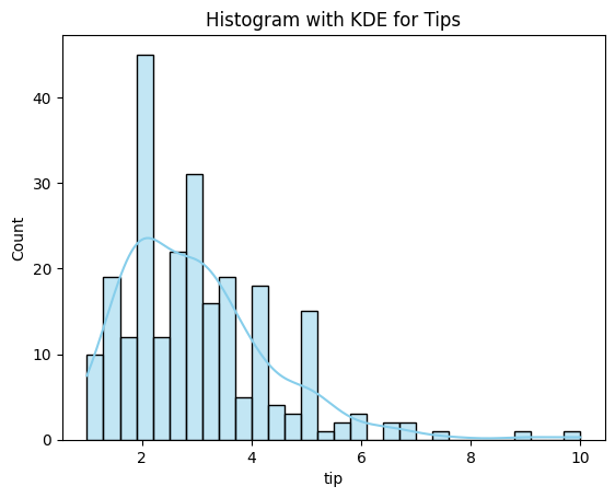
4. 히스토그램과 커널 밀도 추정 그래프 : 수치형 변수의 분포를 히스토그램과 함께 부드러운 커널 밀도 추정 그래프
tips = sns.load_dataset('tips')

sns.jointplot(x='size', y='tip', data=tips, kind='scatter')
plt.show()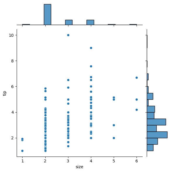
5. 조인트 그래프 : 두 수치형 변수의 결합 분포를 산점도와 히스토그램으로 함께 시각화하여 데이터 간의 관계를 확인할 수 있슴
tips = sns.load_dataset('tips')

# pairplot() 그리기
sns.pairplot(data=tips, hue='sex', diag_kind='hist', palette='husl')
plt.suptitle('Pairplot with Histograms by Gender', y=1.05)
plt.show()
6. 관계 그래프 :여러 변수 간의 관계를 시각화하는 다중 플롯 그래프로, 변수들 간의 상관관계를 확인할 수 있음.
# Load the iris dataset
iris = sns.load_dataset('iris')
# Create a scatter plot to detect outliers
plt.figure(figsize=(10, 6))
sns.scatterplot(x='sepal_length', y='sepal_width', hue='species', data=iris)
plt.title('Scatter Plot of Sepal Length vs Sepal Width')
plt.xlabel('Sepal Length (cm)')
plt.ylabel('Sepal Width (cm)')
plt.show()
반응형
'데이터 분석' 카테고리의 다른 글
| <파이썬 데이터 분석가 되기 - 5주차> 웹 데이터 수집 라이브러리, 뷰티풀수프 (0) | 2025.02.17 |
|---|---|
| 데이터 시각화, 갑자기 한글 폰트가 깨진다면? (1) | 2025.02.02 |
| <파이썬 데이터 분석가 되기 - 3주차> 데이터 시각화 라이브러리, 맷플롯립 - 2 (2) | 2025.02.02 |
| <파이썬 데이터 분석가 되기 - 3주차> 데이터 시각화 라이브러리, 맷플롯립 - 1 (0) | 2025.02.02 |
| <파이썬 데이터 분석가 되기 - 2주차> 02장. 데이터 처리 라이브러리, 판다스 (0) | 2025.01.26 |


